January 2, 2026
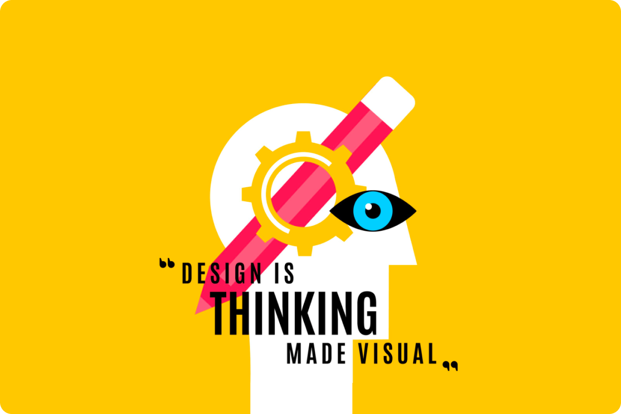
Most Websites Fail Because of Clarity, Not Design
Most websites fail due to unclear messaging, not bad design. Learn UX frameworks that improve clarity, engagement, and conversions.

A surprising number of websites look beautiful but still fail to convert visitors into customers. The layout is polished. The typography is elegant. The animations feel modern. Yet people land on the page and leave within seconds.
After working on dozens of product websites, startup landing pages, and redesign projects, a pattern becomes obvious. Design rarely causes the failure.Confusion does.
When a visitor cannot quickly understand what a product does, who it is for, and why it matters, the experience collapses. Even a visually impressive site can not recover from that.
This article is written for founders, product managers, marketers, and designers who want their website to communicate clearly and convert better. You will learn why clarity is the real driver of performance, how users interpret websites in the first few seconds, and practical frameworks used by experienced UX teams to fix clarity problems before they cost revenue.
Many teams assume improving visual design will improve conversions. In practice, clarity is usually the bottleneck.
User behavior research consistently shows that visitors evaluate a website almost immediately. In usability testing sessions I conducted with early stage startups, participants formed an opinion about a site within 3 to 5 seconds.
What they were trying to answer was simple:
If those answers are unclear, users stop exploring. A visually impressive interface cannot compensate for missing meaning.
A common scenario occurs on SaaS landing pages. The headline sounds clever but vague.The hero image looks polished but abstract. Visitors scroll hoping to understand more, but the message remains ambiguous. They leave before reaching the actual value proposition.
Clarity removes this friction.
Cognitive load refers to the mental effort required to process information. When websites require users to interpret confusing language or decode complex layouts, cognitive load rises quickly.
Users do not consciously analyze this. They simply feel that the site is hard to understand.
Signs of high cognitive load include:
Clear websites reduce this mental effort. The user instantly understands what is happening
Good design supports clarity rather than replacing it.
Typography hierarchy, whitespace, layout structure, and imagery all help reinforce the message. But they cannot invent a message that does not exist.
The strongest performing websites usually follow a simple pattern:
Design amplifies clarity rather than compensating for confusion.
When users land on a page, they perform a fast mental scan. The website must answer three core questions.
This is the most common clarity failure.
Many websites describe themselves using abstract phrases like:
These phrases sound impressive but communicate almost nothing.
Clear websites instead use concrete language.
Examples:
Bad clarity
"A modern solution for smarter workflows"
Clear clarity
"Project management software built for remote teams"
In usability tests, people consistently respond better to the second format because it removes interpretation.
Even if users understand the product, they still need to know whether it is relevant to them.
Clear audience signaling improves engagement dramatically.
Ways to communicate this:
When visitors see themselves reflected in the message, they stay longer.
The third question focuses on outcomes.
User scare about results, not features.
Instead of saying:
"Advanced AI powered analytics dashboard"
Explain the benefit:
"Track marketing performance across all channels in one dashboard"
Clarity turns features into outcomes.
Use this quick test on your homepage:
Show the page to someone unfamiliar with your product for five seconds. Then ask them three questions.
If they struggle to answer, clarity needs improvement.
Over the years, several clarity mistakes appear repeatedly in failing websites.
Marketing teams often prioritize creativity over communication.
Examples include poetic phrases or metaphor driven headlines that look stylish but hide the real message.
A headline is not a slogan. It is the primary explanation of the product.
Clear headlines outperform clever ones in almost every A B test I have run.
A simple formula works well:
Product + Audience + Outcome
Example:
"Email marketing platform for ecommerce brands"
It may sound simple, but clarity converts.
Another frequent mistake involves listing features without explaining their value.
Example:
These features sound technical but provide no context.
Instead, connect features to results.
Example:
Users care about how features help them achieve goals.
Internal terminology often leaks into navigation menus.
For example:
These words may make sense internally but confuse visitors.
Navigation labels should match how users think.
Better examples:
Clear labels reduce friction during exploration.

Experienced UX teams use structured frameworks to diagnose and improve clarity problems.
A strong value proposition explains why a product exists and why it matters.
It usually includes three elements:
Example:
"Design collaboration software for distributed product teams"
This simple structure removes ambiguity.
Value Proposition Template
Use this template when writing homepage headlines.
[Product category] for [specific audience] that helps them [achieve outcome].
Example:
"Customer feedback platform for SaaS companies that want faster product insights."
This format works well because it mirrors how users think.
Clarity also depends on how information is structured.
A strong hierarchy typically looks like this:
Many websites mix these levels randomly.
For example, jumping directly from a headline to technical features creates confusion.
Message hierarchy ensures that users learn information in the correct order.
The five second test is one of the most useful clarity diagnostics.
How to Run It:
What to Look For
If users remember visual elements but not the product meaning, clarity is weak.
Strong websites produce answers like:
That indicates the message is working.
Clarity is not only a copywriting problem. It is a collaboration problem.
Designers, marketers, and product teams must align around the same message.
One common mistake occurs when teams design the interface first and add messaging later.
This leads to visual layouts that do not support the story.
A better process is:
When messaging comes first, design decisions become easier.
Professional copy often becomes overly polished. Users speak more simply.
Good messaging often comes directly from customer interviews, reviews, and support tickets.
Example phrases customers might use:
Using similar language in website messaging increases clarity because it matches how people think.
Clarity is not a one time decision. It evolves as products grow.
Teams should regularly test messaging through:
Small wording changes can produce large improvements in engagement.
Most struggling websites do not have a design problem. They have a clarity problem.
Visitors arrive with limited attention and limited patience. They need to understand the product quickly and without effort. When messaging clearly communicates what the product is, who it helps, and why it matters, engagement rises naturally.
Improving clarity often requires revisiting fundamentals. Simplify the value proposition.Use language customers already use. Structure information so users learn progressively rather than all at once.
This approach works especially well for SaaS websites, product landing pages, and startup marketing sites where first impressions determine growth. It may be less impactful for content heavy editorial sites where readers already understand the context.
Clarity does not replace design. It gives design a purpose. When both work together, websites become easier to understand and much harder for users to leave.
"Vaijanath A."
Founder
Our latest news and trending topics