Technovance

The Challenges
- Communicating Complexity: The company's work in "novel materials/molecules" and "nano materials" is highly technical. The challenge was to present this without overwhelming the user with dense jargon.
- Building Instant Credibility: As an expert B2B firm, the website needed to immediately establish TechnoVance as an authoritative and experienced leader to build trust with potential clients.
- Organizing Diverse Services: The company serves "myriad sectors" with a wide range of products, from "super plasticizers" to "Sustainable Solutions". This broad scope could easily confuse a new visitor.
The Solutions
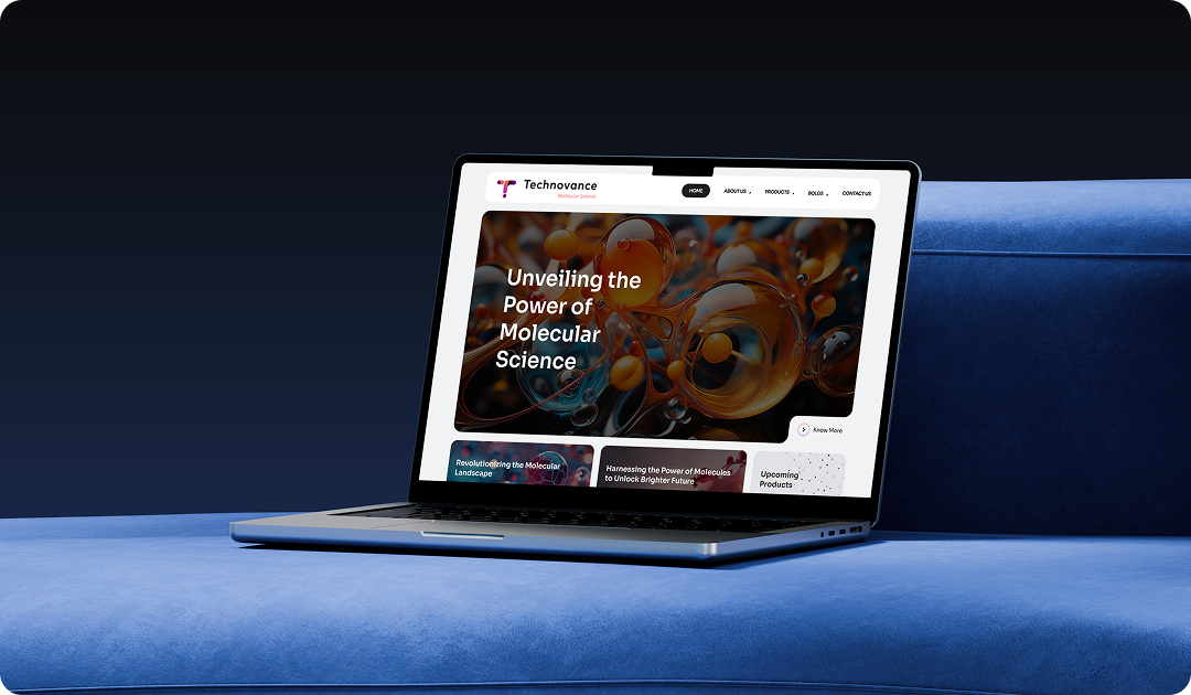
- Clean, Value-Driven UI: We implemented a minimalist design with large, benefit-focused headlines like "Research Drives Results". This focuses on the value of the research, not just the technical details.
- Prominent Trust Signals: We placed the company's key stats—"21+ Years of Experience" and "46+ Experts Research Team"—at the very top of the page. This builds immediate credibility before the user even scrolls.
- Structured Service Grouping: We organized their broad capabilities into three distinct, scannable cards: "The Quest of Innovation", "Tailored Concrete Solutions", and "Sustainable Solutions". This makes their offerings easy to understand at a glance.
Website Typography

The Sora typeface was chosen to reflect the brand's core values. Its clear, structured, and geometric sans-serif design conveys a sense of technical precision and trustworthiness, while remaining highly legible and modern for a digital-first audience.
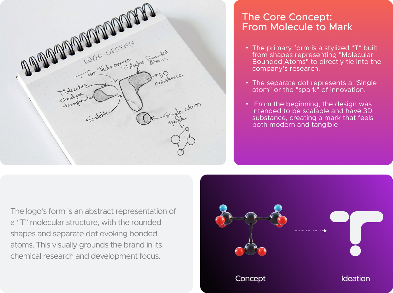
Logo Typography

For the TechnoVance word-mark, the Mark Pro typeface was chosen for its bold, clean, and geometric letterforms. This font conveys a powerful sense of technical authority, precision, and modern innovation, directly aligning with the company's identity as an expert R&D leader.
Client Testimonial
"From the get-go, their team demonstrated an impressive understanding of not only our brand but also the intricate dynamics of social media. They developed a comprehensive strategy that was tailor-made for us, focusing on engaging content, strategic postings, and genuine interactions with our audience. It wasn't long before we started seeing the fruits of their labor - more followers, significantly higher engagement, and most importantly, an increase in sales directly linked to our social media efforts."

See our work
Welcome to the spotlight, where Nova's magic touches down, turning the ordinary into the extraordinary.
Lets work together
Ready to transform your brand's digital presence and unlock the full potential of social media marketing? Reach out today, and let's start crafting your success story together.
%20(1).webp)